The first one we'll call bubbles and the second one we'll call blue circle
Saturday, January 17, 2009
Been a long time...
Well it has been a long time since I last posted. Since the last time I have been working on some projects and trying to get Wicked Photography going. One thing I have done is designed me a logo, which I need help with. I have made 2 that I really like and cadecide which logo to use. Leave me a comment on which one you like by Tuesday!
The first one we'll call bubbles and the second one we'll call blue circle

The first one we'll call bubbles and the second one we'll call blue circle
Subscribe to:
Post Comments (Atom)
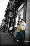
Jordan & Me


2 comments:
i like the top one better as far as the words go, but the bottom one looks like it would fit better on a business card. both are cool looking, but on the second one, you cant see the "i" in wicked b/c of the circle...just my thoughts, good luck!
I like the second one the best. Only thing is, can you take the "i" out of the circle. It is hard to see because of the gray part of the circle. But that is the one that I like the best. Looks more "professional" to me.
Post a Comment